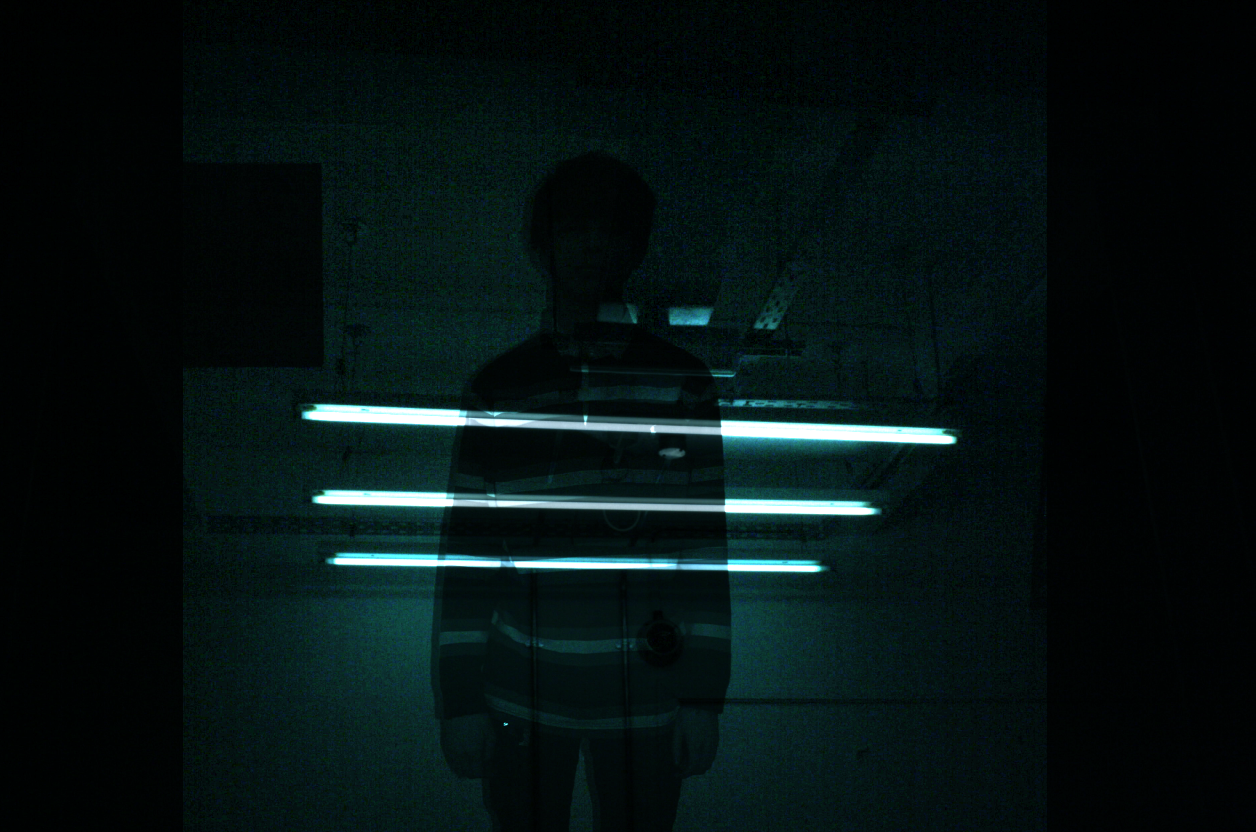
After an induction to photography, I had mistakenly taken some photos of lights where the rest of the photo appeared dark apart from the light. As there are some interesting lights in Leeds College of Art I wanted to repeat this process as a potential photographic approach to the brief. I also felt the electric, bright lights reflected the electric guitar in the song as well as the style of the music overall.
To achieve this my DSLR was set to manual with the following settings:
shutter speed 1/640
Apature F14
ISO Auto
White balance - fluorescent light
these were occasionally adjusted, such as a slower shutter speed to blur the lights. This was my first time using a DLSR for a project and previous to this I had no knowledge at all as to how to work one. I am slowly getting a grasp of how the camera works and how to use the settings. I am pleased with the effect created by the photographs I took and felt that I had a good eye for composition when photographing. I think that the tube shape of the lights resembles the strings on an electric guitar. The lights resemble the bright sounds created by the music and the arrangement of lights in some of the photos represents the beat of the music. Below are some of my favourite photos -
One of the ideas I came up with was to illustrate a human figuire and illustrate further around this to express the feeling of listening to the music and its impact physically. I asked a friend to stand straight for a photograph. I then traced this on tracing paper using the light box.
 |
| Original photograph |
 |
| Traced outline |
I later scanned this in and began to play around with all my photographs and this traced image also. The first image I created involved.After playing around with some settings I used the 'Colour Dodge' effect on the photograph of my friend over a photograph of the lights. This created a spooky silhouette with 3 lights striking through. I liked the mysteriousness of the image and felt that it communicates my personal experience of listening to the music.
I experimented with the line drawing over a blurred light photograph. The composition of the image didn't seem right, both elements did not blend together well.
One of my favourite results of my experimentations featured the outline centred in the middle of a highly edited screenshot of a short film 'Into The Wild' made by the Maccabees. I pasted an inverted version of the outline so that I could achieve a white outline against the dark palette from the screenshot. The black surrounding the outline absorbed the rest of the image when I played around with the 'Colour dodge' setting further. I increased the saturation and vibrance of the base layer (the screenshot) to create a bright outline. This created a mysterious half figure in the centre of the page. I like how the figure appears to absorb into the page like one absorbs into the music when they listen to to the song.
I had experimented with ink to try new materials and make the composition of my album cover more interesting. I had covered a page in a mixture of ink and watered down ink and scanned this into photoshop. I pasted the inverted version of the outline on top of this. I deleted the black around the figure to try a different composition. I preferred this new textured version, The texture was created by the waviness of the tracing paper in the scanner.
I felt that this new figure spoke for itself and the ink background was too busy. So I pasted this onto its own white background. Less is more, and I feel this would appeal to the judges at secret 7 as many of their previous winners have featured a similar minimalistic style.
I then began to develop this image to reflect the effects of listening to the music. I changed the hue to a bright turquoise as I felt this reflected the sound of the song. I used a contrasting electric pink and created swirls using the paint tool to the rhythm of the song (I listened to the song as I created the piece) . Looking back I feel that it would have made more sense for this to come out of the ears, however the eyes are at the centre of the head, where the brain is (which interprets the music) so this seemed appropriate.
I then surrounded the figure in these lines to represent the full body experience of listening to the music, and the feeling of being in your own world when listening to it.
I then tried a different approach whereby I used a fine liner only on an A3 sheet of paper and drew 3 lines to the rhythm of the song across the length of the page. After this, I continued the same lines again and again to create a large linear pattern. Again, I inverted this as I felt this looked better than a black outline alone. It also defines the textures created by the paper more. I changed this to a dark blue as I felt this mirrored feeling deep in the music.


No comments:
Post a Comment