Wednesday, 29 October 2014

Design principles - Colour Theory | OUGD404


For the session our group was asked to wear red and each bring 5 red items. I brought a book, leaflet, pencil, hole punch and china doll. 
We were instructed to cover the tables in a off white paper to make the colours stand out.
Our first task was to lay out all of our objects from light to dark as you can see from the images below: 


Then we had to group our items into warm and cool reds:


Warm, cool, light and dark are all basics of colour theory and understanding them is crucial to graphic design.
We the had to move the yellow groups items into a a circle in which the colours flowed. We grouped the yellows into warm and cool, made a circle and after a few adjustments we created our circle:


Then all three groups yellow, red and blue joined our items into one continuous circle in which the colours flowed into one another: 


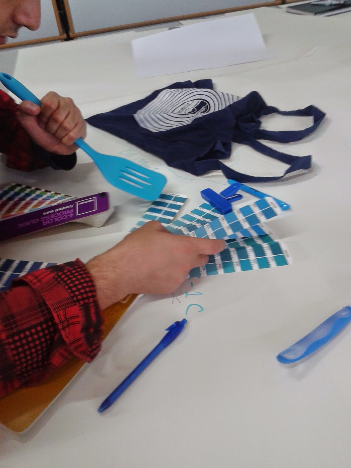
We then began to learn the basics of pantone colours. We used the pantone charts below to identify the colours of our objects. 


We were then asked to challenge the colour matching of the blue group. We found that we disagreed with a lot of their decisions. There seemed to be a confusion between coated colours and matt colours; a concept I still need to get my head around! 

Identifying the pantone colour of a blue spatula

Poster Research Studio brief 4

Broadsides

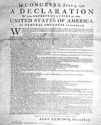
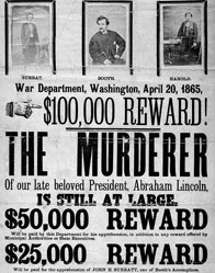
These were the very earliest of posters often used for public announcements and government notifications. They appear textually heavy and were printed on one side only. Informative by text rather than by design. Designed to have a short term impact, this is known as design ephemera.
declaration

Poster Development

As techniques developed, posters began to be more artistic. There was a need for big, bold type to draw attention into the posters so that they could be read from a distance. Metal typefaces could not be made large enough to print these big, bold letters so wood typefaces were used as a printing alternative. Wood type did not have the same resilience as metal but it satisfied the pressure for larger type and it was also far cheaper and lighter. 
This was then followed by the development of lithographic posters and then colour lithographic. A technique whereby a greasy crayon image is layered onto limestone, and then the image is offset onto paper. 

French Posters


The Belle Epoque (Beautiful Era) was the name of a period of financial growth in France. Many lithographic posters were created during this era and therefore illustrators names became more recognised Jules Cheret was a well known french artist and painter. He created many posters in the Belle Epoque style. He developed the chromolithography (colour lithography) technique and creates scenes of Parisian cafes, nightlife and theatres.

European Posters

Alphose Mucha was one of the more well known European artists who is known for his illustrations of women in an art nouveau style. 


Monday, 27 October 2014

Article design crit & Types of Publication


The main points we took away from the crit of our article design was ways to tackle the issue with the white background. The other group felt that the white background was too clean and crisp and did not reflect Alvin Stardusts career. We thoroughly agreed with this but had been unsure how to tackle it - as stated in my previous blog post. The other group suggested how we could potentially use a grainy texture for the background and overlay our content on top. 
Another suggestion was to lighten the 'quote circle' as the black was too harsh on the rest of the design.
From the crit of the other groups work, I learnt that large areas of body copy need to be broken up with elements to make it more appealing to read. 


TYPES OF PUBLICATION 


Terms technically refer to the physical size of the publication. This is ultimately determined by the size of the printer. Terms are often confused to describe typical content.

BROADSHEETS

-Financial Times
-The Sunday Times
-The Daily Telegraph

Large format (75cm x 60cm approx) - can be difficult to read due to its size.

Associated with business, seriousness, politics, detail, stocks, academic tone, textually heavy.
Term used to refer to low quality, single sheet in broadsheet size. Typically folded in half and different in content- usually more illustrative.

BERLINA 

-Guardian
-Observer

Smaller than a broadsheet, larger than a tabloid. (31.5cm x 47cm approx)
Typical European format.

TABLOIDS

Smaller size (43cm x 30 cm approx)
Term comes from the word tablet. Tabloid was a smaller, easier to swallow tablet. Hence the compression of size and content of tabloid papers.

Size of tabloids usually taken up with larger titles/font size, adverts, less body text - unlike compact tabloids :


COMPACTS( SUB CATEGORY OF TABLOIDS)

The Times
Daily Mail
Independent

Same size as tabloids. Larger word count. Typical Broadsheet content (more academic), tabloid layout.

Saturday, 25 October 2014

Article Design Task | Alvin Stardust


 Alvin Stardust, glam rock singer, dies aged 72


Designing for a death can be challenging. A balance must be kept between keeping the design sensitive yet celebratory of that persons life. We found this particularly difficult with Alvin Stardust. None of our group had heard of the singer which didn't make our task any easier. We tried to get an idea of his personailty from our research and the general idea we got was that he had a quirky personality and style but had a serious side to him. For example his dress sense is rather 'out there' yet he is also featured in an ad encouraging children to cross the road safely.
To express both sides of Alvin stardust we decided fairly quickly to keep an image of the star black and white, yet have subtle pops of colour across the article to reflect his life and career.


A brief mind map of our research of both design and Alvin stardust himself. 


 We kick started our design research by considering where this article might be featured. Music magazines came to mind so we analysed the layout of these. However, most article layouts we found were interviews or announcing new albums. We did find one article similar to ours - an article about the death of Amy Winehouse. This was helpful to us in that the theme was the same, but the personalities of the two stars are particularly different. Also, having only one article of this theme made it difficult to decide which direction to send this in.

We liked the overall design of the layout of the Amy Winehouse article. We preferred the idea of using the dates rather than "dies age 72" as this seems more celebratory and less saddening. Other features we considered were having a large image of the star on one side so the page layout is readable. The circle in the article also attracted our attention as this would add a quirkiness to our design, reflecting Stardust's personality. 

We were drawn to this article design because of the image spanning the whole two page spread. This gets rid of the boring white background which we felt would make the article too serious. The shorter columns also seemed appropriate so that there was a focus on the image but content was still there. 


This article appeared to have the subtle colour and quirkiness we were looking for for inspiration. The idea of having square images around the page seemed appropriate to our design and we felt that album covers would fit nicely into this. The POP of colour is also a subtle characteristic of the article but it still appears professional.  

Below, we began to create potential grids for our design. 
The first image is taking the idea of having the image spanning the whole page with the content over the top. We felt 3 columns was enough to hold all the information and a circle would contain a quote relating to the star.


We then began our work on indesign so that we could create a variety of designs quickly to see what worked best. Below are hand rendered versions of some of the indesign articles we created. 


We continuously took screenshots of our work as a record for future reference. We began by trying to create our first draft with the image spanning the page. The difficulty was we could not find an appropriate image. Ideally an image using the rule of thirds would have worked so that there was space for text. We felt the first photograph below was very appropriate for the article and I agreed. However, this made our task difficult as we began to become too focussed on designing around that exact image. The first issue came with the size of the image. For the image to work it needed to span onto the second page. Naturally, I wanted the title to be a similar length to the image, but we didnt want the text to become wrapped up in the centre of the pages as often text is lost in the binding of a magazine. There was not space to create out first design so we created the element and began to move them around.
The placing of the date was another issue as we struggled to find a place where it fit and looked inline with the rest of the article. We decided to add a pop of colour by using a red for the date and a timeline of albums at the base of the article. This is similar to the POP design from before. 


As we began to place the album covers something just wasn't quite working. They seemed to look out of place and the wrong size. The inconsistency in colour was equally frustrating. 


We decided to take inspiration from his album artwork. We felt  typeface often used on his album covers was appropriate to reflect his work. We could not find the specific font used on any album covers but one font which came up a lot was similar to Bodoni Condensed. Since we did not have this font on the mac we were using at the time, I had to create the text and email it to a group member to add it to the design. When creating the text, I tried to make it as similar to his albums as possible by reducing the kerning, boldness and height of the letterforms. I personally felt this text instantly improved the design.


We then added the 'quote circle' to the middle of the columns. At this point in time we only as two columns as this fit well with the current image. As we are inexperienced with indesign, we were unsure how to wrap the text around the circle. So it was purely there for illustrative purposes. 

One group member came up with the idea to have the dates on top of each other so that it would fit more easily into the article. Once we tried this, we all agreed it looked much better. We began to experiment with places that the new date could fit. It seemed to fit best above new shorter columns but something just wasnt quite right with the article. 


We added quote text which brought the article together a bit more but something still wasn't right. 


We added a red border similar to the article we found in the research and added the deep red date (a deeper red seemed more sophisticated and sensitive than a bright red)
 We were still unhappy with the design overall, it seemed to look odd without the grid system
So, we agreed to try designs with a different image. We took our elements into a layout similar to our first design and the Amy Winehouse design. This meant the image was only on one side of the page. We felt the article looked good but it was too editorial and did not reflect the stars work. 


We played around with this design a little bit more by enlarging the circle but this still wasn't working, 


 We did another image search for a rule of thirds photograph of Stardust. This was pretty much the only image we could find. The detail of the background made it too difficult to create columns over the image that looked good. We considered using a black or white text box with a low opacity so the text looked clearer and readable- but this instantly looked wrong. 

 We had one final pop at designing in this style but we then decided to go with our final design from the first development with the red border as this seemed to be the most successful. In a way, our article design was inconclusive and we felt that if we had had a week to design rather than an afternoon, our results would have been more successful.

Potential final design - inconclusive 

As a group, I felt we worked really well together. We were one team member down which did not help but we still achieved a good balance of work. The whole team happily input some good ideas and opinions as we developed our design. One team member drew out neat versions of our grids whilst we developed the design which was very helpful for all of us. I feel that every team member put an equal and fair input into the design and our ideas and feedback often complimented each other. I personally feel that our inconclusive design is not down to our teams work, but more down to our inexperience with designing for articles with such a theme, our lack of knowledge of the star, our lack of indesign experience (which made the process slower) and the general difficulty overall with designing for such a subject. However, I definitely feel like I have improved with editorial design already.


Thursday, 23 October 2014

Further Grid Research - OUGD403

The Fibonacci & Golden Ratio 


This forms the basic paper sizes and achieves overall balance in design. This ratio is also evident in nature as well as design. For example, the whole human body and its parts fit the ratio.

8:13
1.62

The Fibonacci Spiral 

Often, designs are said to perfectly fit the golden ratio such as the Apple logo. Yet often, the designers claim to have not considered the ratio in the creation of such designs. The question is, are these merely coincidences, plans behind the design or just a good design eye? 


Canons

Canons are the principle of page layout design.They are used to measure and describe proportions, margins and print area.

The Van De Graaf Canon
Usually used for pleasing proportions in book design. Also known as the secret canon. Within the red boxes is the printable or body text area. 
The marginal proportions are 2:3:4:6 (inner:top:outer:bottom)


Tschichold's Canon
Jan Tschicold slightly altered the ratio of Van De Graafs original canon to meet proportions that he saw fit. Below a ratio of 34:21 is used in what is known as the Ocatavo. The lines from corner to corner determine the corners of the printable area.
Ocatavo Format Page 
Below is an illustration of the 'Golden Canon of Page Construction' which relies on a ratio of 2:3. As you can see the circle determines the height of the printable area.
Golden Canon


Rule of Thirds 


The rule of thirds is a technique more often used in photography. It involves an imaginary 3x3 grid over the photograph. The main subject is supposed to align with one of the vertical lines or another 'hotspot' as you can see from the Bee photograph above. This usually results in the focal point being to either the left or right of the image.  This technique allows photographers to draw attention to certain elements. 


Grid Issues - Studio brief 2 - OUGD403

As I have been constructing my grid from the original typeface Bodoni, I have encountered some issues. As I effectively traced Bodoni to create the new typeface, I was very reliant on the shape of Bodoni itself. However, as I checked to see if my letterforms fit my original grid, they did not. I have worked out that this is because on every computer, the version of Bodoni is very slightly different. I created my original grid on my own computer and it appears to be different in shape and form. Therefore, I have created a new grid that fits my typeface and the Bodoni version equivalent to the LCA macs. Of course I will need to apply the 3 layered process when creating my regular version. 
A single layer of the previous grid

New grid version

Typeface development - studio brief 2 - OUGD403

After an illustrator session, I began to create vector letters using my original font Bodoni as a guide. The process involved firstly typing the letter then using type > create outlines to add anchors to the type. I would then use the pen tool to create vectors around the letterform to fill in the gaps and spaces. Once I had completed this, I merged both the letterform and my new vector into one shape.
My original design was Occupy regular, as you can see below. However, I began by creating occupy bold as this was not only quick to make but also meant I could create my initial font very quickly. As a result of this process I developed 4 different typefaces.  

To create Occupy light and ultra light I selected all the letterforms from my bold typeface. I then edited the settings of the vectors so that the letterforms were not filled in, but only outlines. Then to create occupy regular, I  copied the ultra light design and repeated this 3 types in different positions. I selected ultra light to create regular as if the lines were too thick the layers of letters would be lost. 

I placed my final alphabet as a whole on the standard grid on illustrator so that the letters lined up correctly.


Occupy Bold


Occupy Regular 


Occupy light 


Occupy Extra Light 


I then began to put my letters into words as a trial run. The letter U stood out to me as it just seemed too wide compared to the other letterforms. This wideness was created by the serifs on the Bodoni O. Therefore, I decided to reduce the wideness of the U so it was more consistent with the rest of the typeface.


original wider 'U'


New 'U'


Wednesday, 22 October 2014

Problem Solving - Studio Brief 2 - OUGD403

 In my crit, I brought up the fact that if I follow the rules of creating my letterforms E, H and N will all turn out as squares. This would cause problems with legibility. As you can imagine, the word HEN would be completely illegible. I had a few ideas from student such as enlarging the smaller triangles which I had already experimented with. Also, drawing lines instead of triangles. I began to experiment with this ideas and others to create a sheet of design sketches.

I was really struggling to come up with designs, so I searched for existing geometric fonts. This font below in particular helped me. I liked how for the H the cuts into the letter were thin but the letter is still legible. I also liked how a single triangle was cut out of the N as this will blend well with the rest of my alphabet. 

Below I began to select my better letterform designs and refine these. I drew out my whole potential alphabet to help me visualise the letters within this.  I Also experimented with the word HELLO as this word contains two of the problem characters. I am considering keeping the E as a square but I am  still unsure about the legibility of this letter even if there is only one in the alphabet. 


I then very roughly used to grid to sketch out some quick letters on illustrator. I feel that the N with slabs works better than the pointed stroke as it seems to have more uniformity. 


I only tried one H, whose idea was drawn from my research.  I think this letter is successful. I am considering using this same technique for the E to make my alphabet consistent.