For the session our group was asked to wear red and each bring 5 red items. I brought a book, leaflet, pencil, hole punch and china doll.
We were instructed to cover the tables in a off white paper to make the colours stand out.
Our first task was to lay out all of our objects from light to dark as you can see from the images below:
Then we had to group our items into warm and cool reds:
Warm, cool, light and dark are all basics of colour theory and understanding them is crucial to graphic design.
We the had to move the yellow groups items into a a circle in which the colours flowed. We grouped the yellows into warm and cool, made a circle and after a few adjustments we created our circle:
Then all three groups yellow, red and blue joined our items into one continuous circle in which the colours flowed into one another:
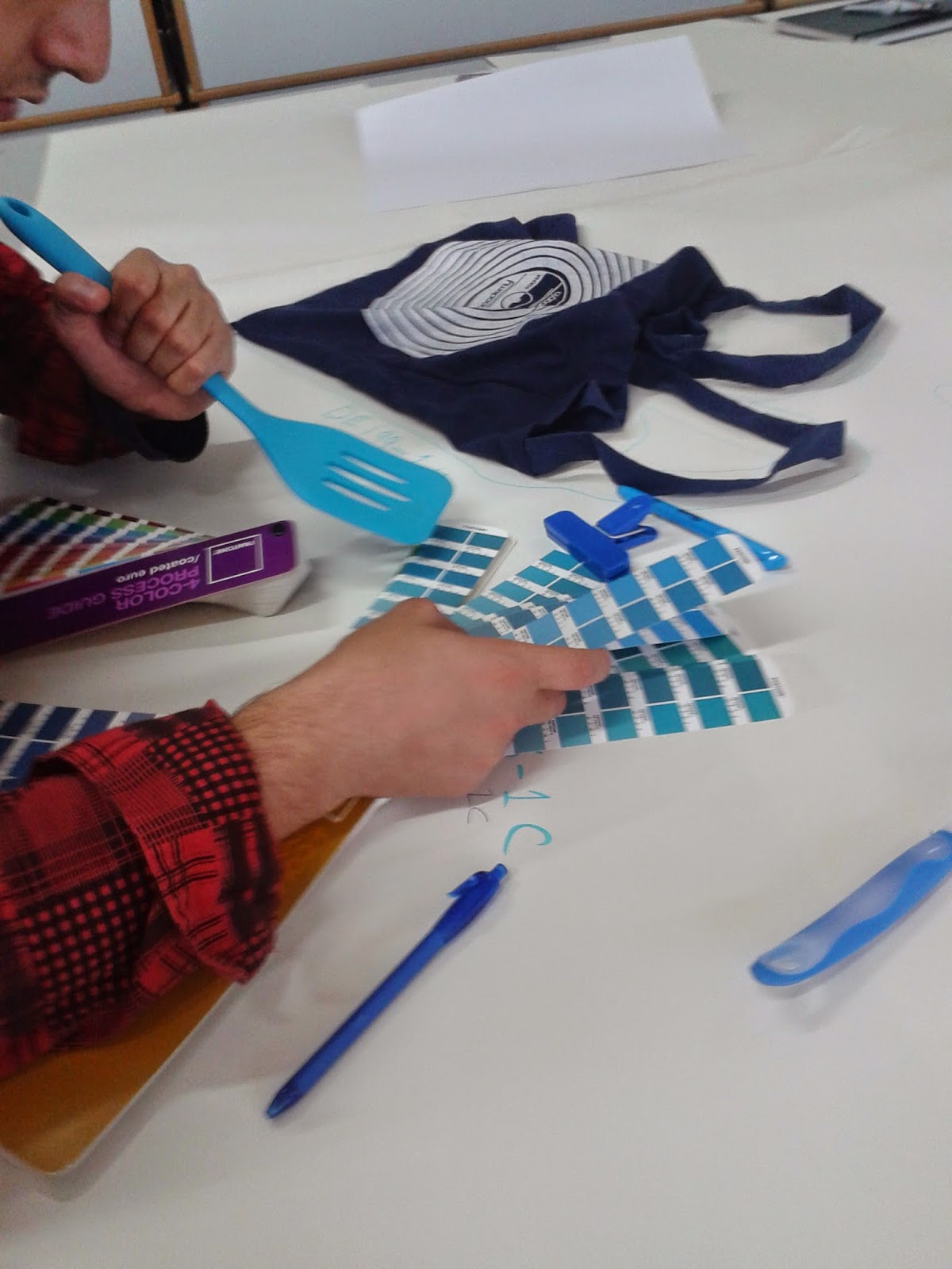
We then began to learn the basics of pantone colours. We used the pantone charts below to identify the colours of our objects.
We were then asked to challenge the colour matching of the blue group. We found that we disagreed with a lot of their decisions. There seemed to be a confusion between coated colours and matt colours; a concept I still need to get my head around!
Identifying the pantone colour of a blue spatula
.jpg)


No comments:
Post a Comment