I am currently designing letterforms to visually communicate the word "Occupied/occupy". I am using the font that describes me from a previous task Bodoni. This word seemed tricky at first but once I began brainstorming I developed a few ideas. I first considered the obvious meanings of occupied- filled up, being used and busy. I explored allowing the letterforms to occupy more space on the page and having the counters filled.
I also researched and explored the idea of keeping occupied. This mainly applies to parents trying to keep children occupied, usually with toys and games.
Another theme I considered was the idea of the mind being occupied, either wandering with thoughts or being busy with thoughts.
I have finally looked at the idea of the 'digital age' and how our lives are occupied with technology, phones and screens...this only adds to the business of modern life and how we are always occupied with something.
My initial ideas are shown below -
My very first ideas- occupying the space, a basic filling of the counter but no edit of the rest of the letter. Secondly, an illustration of a child colouring in the letterforms.
Student feedback
Colouring design- "I really like this one, simple idea. contrast between a really smart clean font and really rough edges" "maybe play with colours and crayons"
My thoughts
I like the idea of filling the counters- however I feel like this design could be developed further. It is too similar to the original letterform.
I am still unsure about how the messiness would work on the second font but I like the idea. At first I was frustrated by the lines of the sharpie being visible in other designs but maybe this would be a good texture to embrace.
Widening the strokes on one half of the letter- playing on the occupation of space.
Considering the idea of becoming occupied- the letter being filled up.
Student feedback
no specific comments
My thoughts
I find it hard to visualise want these letterforms would look like as a font as the sketches themselves are fairly messy. Perhaps this is why I dislike these designs but I do like the full lower case a. I feel that the thicker stroke on the right of the letterform adds movement to the letter as well as actually taking up more space on the page- fulfilling two definitions of occupied.
A continuation of the letter filling up/becoming occupied but from a horizontal angle.
Thickening the serifs (slab serif) and filling counters-more space occupied by letter than first sketch.
Student feedback
"Maybe try a gradient?"
Positive reaction to filled counters
My Thoughts
I think I could play around with how much of the letterform is filled up with colour. I still feel that this design is too similar to the original font and limits the creative potential of the letter forms.
I think the thicker 'slab' serifs are fairly successful, but it bares too many similarities to already existing fonts, such as Rockwell.
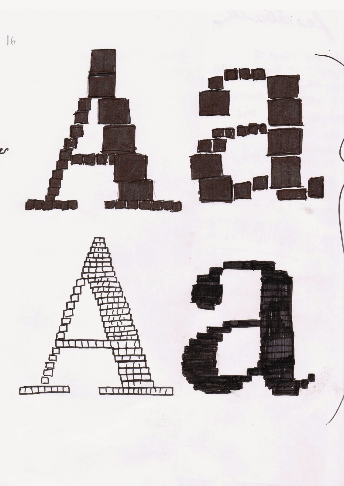
Idea of the digital age- bitmap fonts were first used on computers. First font shows different sized 'pixels' or these could be described as screens.
Second design- I considered the actual size of pixels and tried to replicate this more realistically.
Student feedback
"I like the idea of screens and that today everyone is glued to them, maybe make this idea more obvious, like include technology, maybe logo, sketches of phones, computers etc"
"MY FAVOURITE" "Maybe with monitors, TVS, computers, IPhones, keyboards etc"
There was a preference towards the different sized squares.
My thoughts
This idea seemed to get the most positive response. The ideas such as this, the mind wandering, and keeping children occupied, were described as "innovative" and "creative". I am considering the idea of inputting screens etc into the design but this could become overcomplicated. I may continue experimenting with this idea by creating my own pixel letterforms.
Layers of letters- business, a lot on the mind, occupied with many things.
Empty space- the areas of missing letterform are occupied with something else. Some lines thicker to add definition to the letter and allow clearer identification of shape and form.
Student feedback
Add more lines, repetition (movement)
Like the idea of business
Positive reaction to both letter pairs- reasons unspecified.
My thoughts
These are two of my favourite designs. I like the simplicity of the lines but how this is different enough from the original. I may play around with overlaying full letters with different opacities.
I may try both ideas with thicker strokes and no counters.
Exaggerating the initial idea of the letterform occupying more space on the page. Allowed counters to make letter identifiable.
Playing with the idea of a thicker stoke on one side, also enlarging the finials.
Student feedback
No specific feedback
My thoughts
With the first design, it was difficult to design the counter for the lowercase a. I think that the uppercase A was far for successful as the letter can be defined more easily. I still feel that I can be more creative though.
I was really fond of the enlarged finials. I may input this into other designs. I do however feel that the design is a bit boring.
Idea of the mind wondering, a form of procrastination. The letterforms are unfinished or trailing off (thoughts trailing off) I experimented with doubling the lines to add more depth to the letter.
Second letter forms were traced very loosely- as if the mind is wandering.
Student feedback
"Could you make these letters look busy?"
"Finished to unfinished ----> Like starting off focussed and then your mind wandering"
My thoughts
I liked the original idea for this design and I think the letters look quite different. I'm unsure how these letterforms would work in context. I prefer the letter forms with more structure to them. I may try this idea using a thicker letter form I have created as a base. This way I am combining my ideas and therefore my work will be more original.
Snakes and ladders- occupying a child (or yourself) with games.
Continuation of letterforms occupying more space.
Student feedback
"innovative ideas of way that display occupying your mind"
"This idea of visualising occupy through the medium of occupying and filling the counters is an effective way to display your meaning"
My thoughts
Uppercase letters seem to work better with the 'filling in' technique. If I am to make a finished draft for these letterforms I will only use the uppercase. This must work better due to the lack of curved lines in uppercase letters.
The snakes and ladders idea was creative but I'm just not too fond of the design.
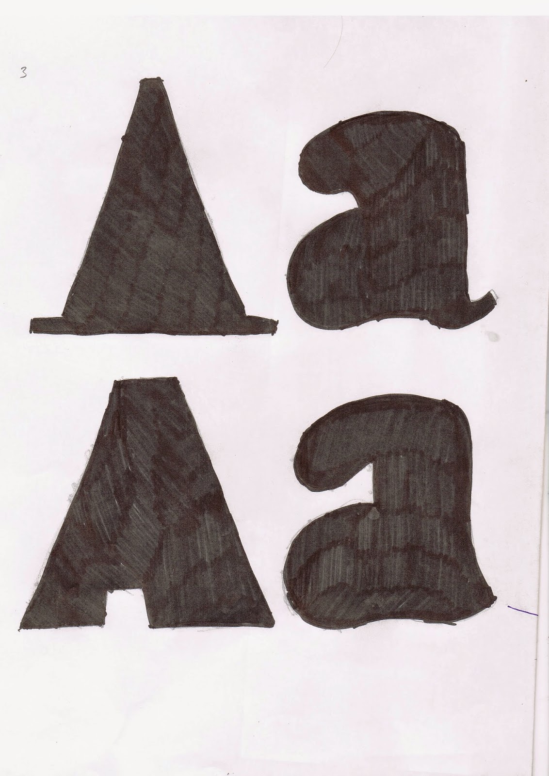
And more variations of this. Trying to identify which shapes work best.
Student feedback
In response to bottom letterforms "This serif works well. Flows more with the text being filled in more than the one above"
My thoughts
I really dislike the top design because the A seems to look like a traffic cone or a hat! It seems to work better in the lower design with no serifs but having all the stokes thickened.
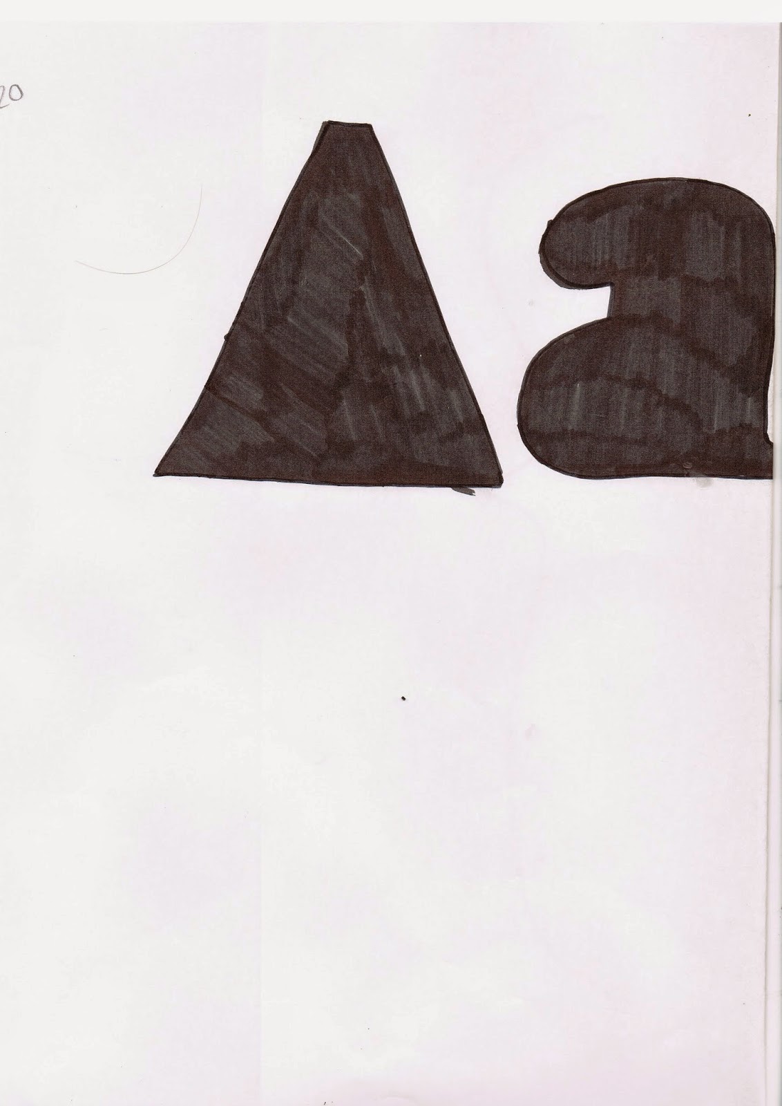
A further pair of space occupying letterforms.
Student feedback
No specific comments
My thoughts
I feel the abstraction of the A into a triangle was successful. Again, this does not work as well in lowercase form. I may overlay multiple abstract shapes as an experiment.
Occupying child (or yourself) with games- scrabble.
Student feedback
"wouldn't really work as a type based font but would be good for logo use"
My thoughts
I feel that although the design is successful, it is not creative or original. I have combined two existing designs with little input from myself so I will not continue with this.
Initial Design Development (After Crit)
One of the ideas suggested by the group really inspired me- the idea to make the letterforms occupy each others space. I have therefore tried this technique with my more successful designs. I have also tried using the overall outline created by repeating the letterforms and filled this in. I plan to continue experimenting with these ideas and then get feedback for the drafts insight of my final 10 designs.


No comments:
Post a Comment