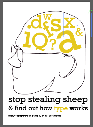
I decided that it most most appropriate to focus my designs on typography, as this reflects the content of the book. I also felt it was best to focus some of my ideas on my research into Erik Spikermann as he is such an influential designer. For many of my designs I decided to focus on the letterform 'a' as Spikermann states in a video interview that this is his favourite letterform. As I was sketching my designs, I kept my research up in front of me to give me inspiration.
Below are the sketches I came up with.
INSPIRATION
My first set of experiments was focussed on the elements that I selected from my research below:
 |
| The colour scheme of FontShop founded by Eric Spiekermann |
 |
| Officina serif designed by Spiekermann |
 |
| Eriks physical features & typomaniac mind |
 |
| Erik loves letterpress and the letterform 'a' |
EXPERIMENTS
I began with an individual character as the main focus of the image. This simply and clearly communicates that the book is about type. As Spiekermann's typefaces are not affordable for me, I decided to select a typeface similar to ITC Officina Serif, which was Rockwell. I played around with the composition of the type, title and authors on the page however I felt that I could produce something more creative. I experimented with red rather than yellow as this is the colour that Erik Spiekermann typically uses, however I felt that the results were not as successful as the yellow.
I started to play around with the idea of "Stop Stealing Sheep" - or copying others. So I began to repeat the letterform 'a'. I showed this letterform in different weights and styles to illustrate the effect of type as well as the minor differences when copying others work.
I then copied this arrangement much more to emphasise the extent of copied and repeated ideas.
I then tried to create a more obvious visual representation of Spikermann, and so I traced a photograph of him using the paint tool in illustrator. I created a speechbubble for the title as if he was telling the reader himself "Stop copying people!". I continued playing around with the composition of titles, letters and illustrations using the head.
A few final ideas I had were to create letterpress style shapes to illustrate Spiekermann's love for letterpress. I also created the ideas I derived from my research - green letter 'i's' to look like grass for sheep as well as using a letterform to frame the titles.
I was really pleased with how my first set of experiments worked out as at the beginning of the brief I had been very unsure how to approach the design. The colours work really well for a book cover and I feel that using yellow screen printing ink will be very bright, effective and eye catching. I am also really enjoying using Rockwell - a typeface I had never considered before. The slab serif style is visually appealing to me. At this stage I feel that the critique will be most useful in helping me understand how to improve the designs as it is more useful to have another person look at the designs from an alternative angle.
CRITIQUE WITH SECOND YEARS
It was very interesting to get some feedback from the second years about our book covers. They have us some very useful tips for effective screenprinting including :
-Use crop marks and bleed marks to ensure accuracy when lining up screens for print.
-Add a bleed to your designs so there is no white edge.
-Smudge your mixed ink on paper first to test the colour as this will look different in the pot.
I took the following 4 designs from my experiments into the crit:
The outstanding favourite was the repeated letter 'a' design because
of the copied letterform(s) which relates to the meaning of "Stop Stealing Sheep". It was suggested that I develop this design by making it more minimal as Spiekermann's work follows a minimalistic style. A group member suggested a letter B at the beginning of the As to look like 'Baa' relating to the sheep in the title. This idea has mixed reviews as whether it was cheesy or effective! Another sheep related idea was to put all the As in a pen (like sheep). I expressed that I wanted to steer clear from sheep designs as it feels a bit too obvious, the second and third editions also illustrate a sheep. I want to create something a bit different. Further feedback for this design was to use less As and make the title less squished at the top of the page. It was useful to have a new set of eyes looking at the organisation of the design and this feedback was helpful to me. It was finally suggested that I could try the design with a grey or white background instead as well as getting rid of the illustration of Spiekermann's head as this was not necessary.
The letterpress design was said to look too much like a ransom note and did not communicate the meaning as effectively - as well as the subtitle being too large.
My personal favourite from my designs featured the large head illustration with letters inside, so I was disheartened to hear this was not a favourite. I would personally have continued this design however, the reaction was so strongly for the alternative design that it seems most appropriate to develop this instead.


No comments:
Post a Comment